Are you looking to create an infographic chart, but you aren’t sure how to start? Well, we’re here to help!
Infographics are one of the best types of content marketing, and they can boost your SEO. But they’re only effective if they’re engaging. There are several types of infographics, from flowcharts to timelines.
How do you know what you should use for your infographic? What do you need to know about the different types to create the best one?
We have all the answers you’re looking for. Keep reading below to learn about creating an infographic chart.
Determine Your Purpose and Audience
Before creating a chart, define the purpose of your chart and identify the specific audience you want to communicate with. This will help you choose the right data and design elements.
For example, charts aimed at children should be colorful and easier to understand, while adults may appreciate more data to digest.
Collect and Visualize Data
Next, gather the data you want to present in your infographic chart. Make sure the data is accurate, relevant, and supports your purpose. Analyze the data to identify key insights and trends.
Simplify complex data by focusing on the most important points. Remove unnecessary details and ensure that the data is understandable. Use visuals such as icons, illustrations, and graphs to represent the data. Color code the elements to highlight key information.
Design the Layout
Plan the layout of your infographic chart. Determine the size, orientation (landscape or portrait), and structure of your chart. Divide the information into sections and use a visual hierarchy to guide the viewer’s attention. Keep the design clean, uncluttered, and appealing.
Select appropriate fonts and typography that complement the design. Use clear and legible fonts for headings, subheadings, and body text. Maintain consistency in font styles throughout the infographic.
Add Visual Elements
Enhance your infographic chart with relevant visual elements. Include images, icons, illustrations, or graphs to make the information more engaging. Use visual cues such as arrows, lines, or labels to guide the viewer’s understanding of the data.
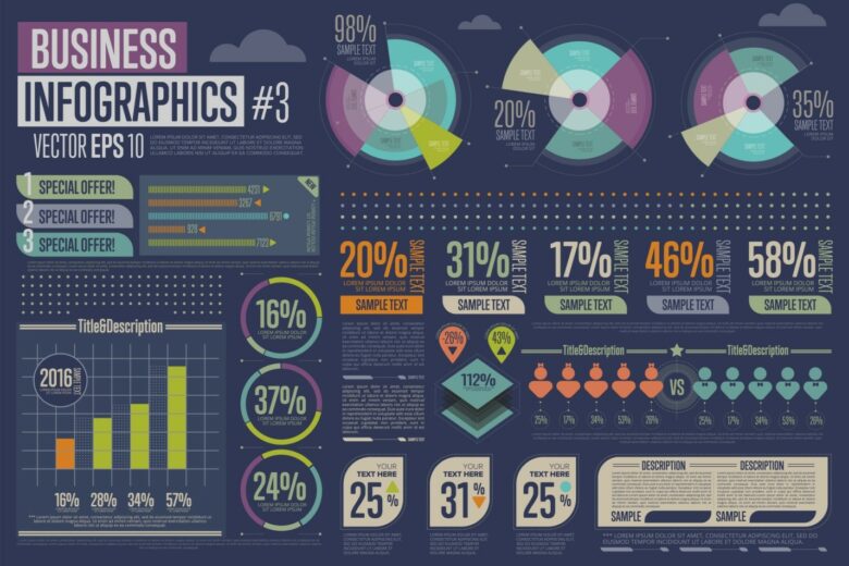
There are also various types of charts available, such as bar charts, pie charts, line charts, area charts, and more. You should try this to see all the charts in real time. Select the chart type that best represents your data and communicates your message. Consider factors like the type of data, the relationships you want to show, and the visual impact you want to create.
If you’re creating an infographic chart for a company or brand, incorporate their branding elements such as logos, colors, and visual style. This helps to maintain consistency and reinforce brand identity.
Revise and Share
Once you’ve created the initial draft of your infographic chart, review it. Check for any errors, inconsistencies, or misleading representations of data. Make necessary revisions to ensure accuracy and clarity.
Once you’re satisfied with the final version, save your infographic chart in a suitable file format (such as PNG or PDF) and share it with your target audience. You can use it on your website and social media platforms or include it in presentations to convey your message.
Make Your Very Own Infographic Chart
Creating an infographic chart is a great way to add visual interest to data. With some planning, you can design a pleasing chart to communicate your message. Have fun and experiment with colors, fonts, and shapes to make an eye-catching infographic. Now go forth and begin creating your own awesome infographic chart!
Did you find this article useful? Keep reading our blog for more!
Article by Born Realist