Logos are usually used to describe a message. Companies use logos to show some hidden meaning. Many of you don’t know that logos are not designed for just outer beauty but to convey some message. All the companies big or small do have their logos which becomes their sign of recognition. Logos are made in a very innovative way. A logo can be a single line, color or some specific color. Here are 17 famous logos that have hidden meanings and messages that you never would’ve thought. Have a look:
17. Adidas:
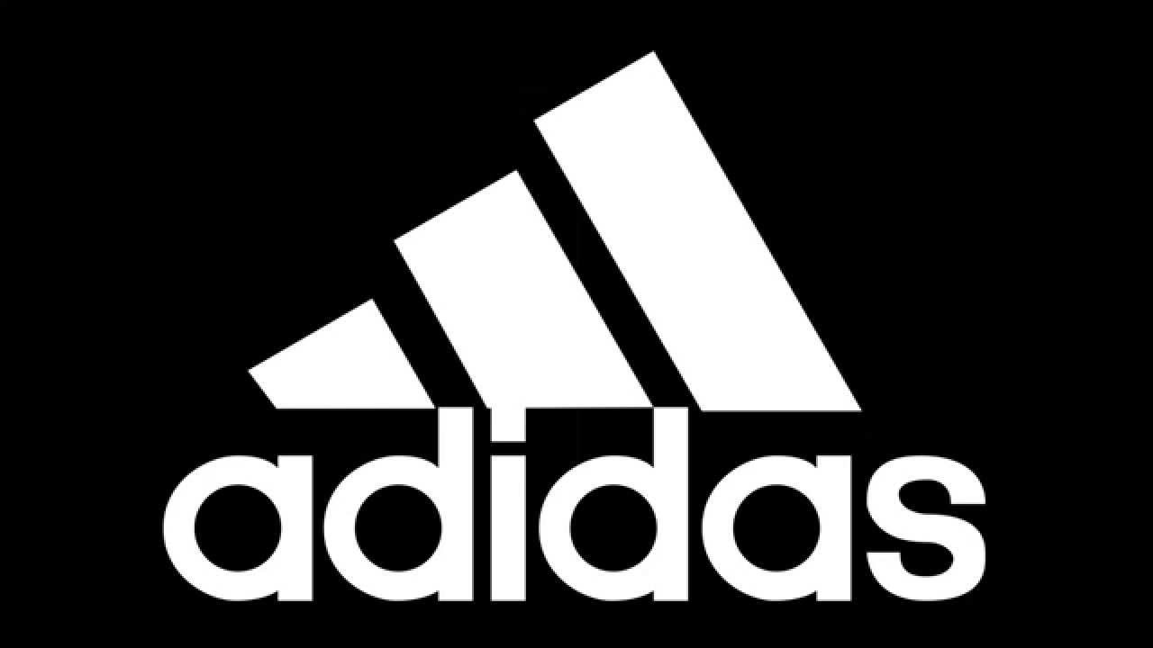 Adidas is one of the most famous companies out there. Adidas got this name from its founder Adolf Dassler. Its logo includes three stripes. Although the logo has been changed many times over the years the three strips thing is consistent. The strips are put together in such a way that a triangle is formed. The triangle in reality, shows a mountain. A mountain represents the life challenges of an athlete which he will have to go through over the years.
16. Baskin-Robbins:
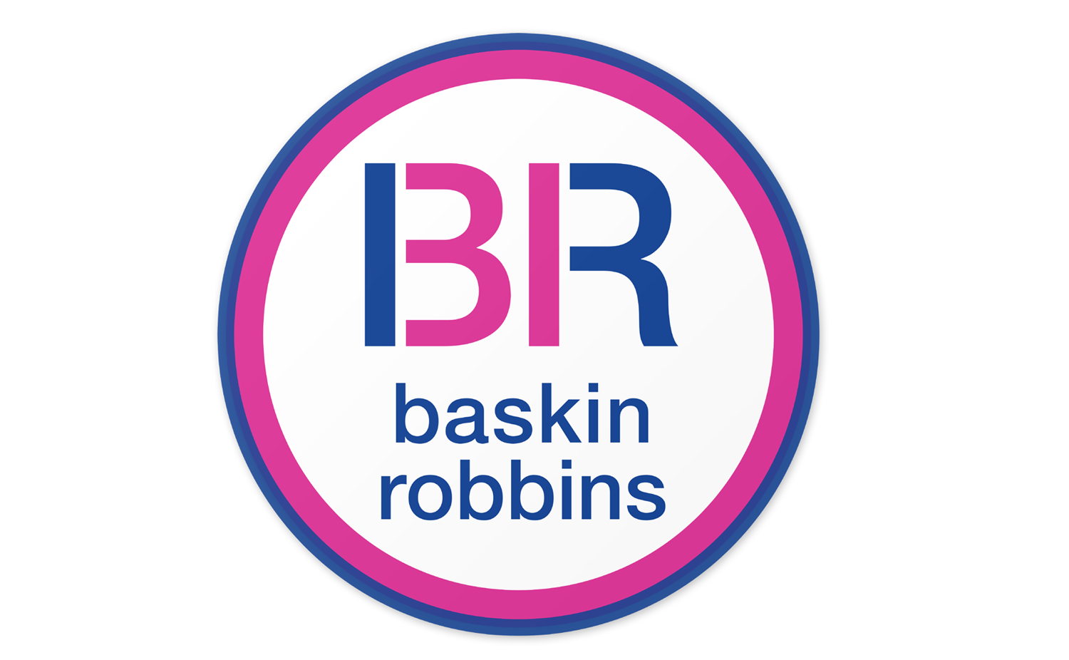 Baskin-Robbin is a very famous ice cream store. The pink color area of BR logo makes up 31 colors which are the number of flavors that it used to sell over many years.
15. BMW:
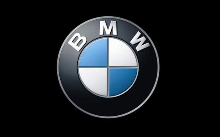 The middle part of the logo actually symbolizes the two rotating blades of an airplane. It also represents the history of technology of the airlines. BMW in reality, originated in Germany.
14. Apple:
 The Apple logo was originally designed by Rob Yanov. The idea of the logo came to him after he bought a bag of apples and placed them in a bowl. The bite in the design was to differentiate it from a cherry. He later realized that the word “bite” was similar to the word “byte”.
13. Amazon:
 Apparently, Amazon logo does not depict anything but it does have a logic behind it. The orange arrow is equal to a smile, to make its customer feel friendly and satisfied. The arrow also raised a question that why is it stretched between A and Z. It shows that the company sells everything which a mind can think of.
12. Toyota:
 People have been comparing the logo of the Japanese car Toyota with the image of a cowboy who is wearing a hat as always. But in reality, it gives you an insight into the company’s past days when it used to make weaving machines. Also, the logo spells the letters of the company’s name.
11. Mobil:
 The logo of this company shows its importance in its colors. Red color represents strength and blue color shows faithfulness and the security the company provides.
10. Mercedes-Benz:
 Mercedes-Benz logo contains three stars which represent the company’s dominance which they deliver in quality and the style over things like land, sea, and air.
9. Formula 1:
 The number 1 can be seen between the letter F and the red stripes in the logo of Formula. Red color stripes in the logo also show the representation of the fast speed of Formula one.
10 Most Paused Movie Scenes Ever
8. Hyundai:
The logo of the company Hyundai is ‘H’ which a lot of people of people think is just the initials of its name. But in reality, it symbolizes two people including a client and a representative of the company who are shaking hands
7. Vaio:
 The logo of Sony Vaio sort of makes a wave, which represents an analog symbol. And the last 1 and 0 represent the symbols of a digital signal.
6. Toblerone:
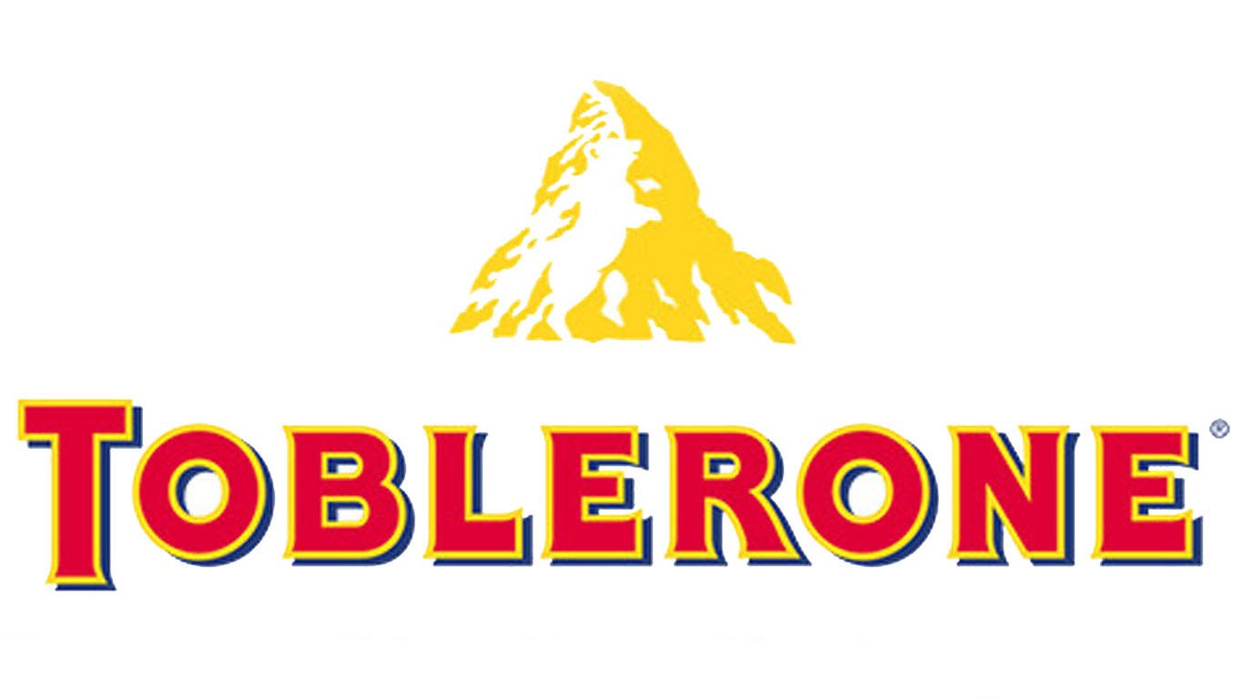 Toblerone, famous chocolate is based in the city of Bern. Its logo has a silhouette of a bear which symbolizes that Bern is also known as the city of bears.
5. Beats:
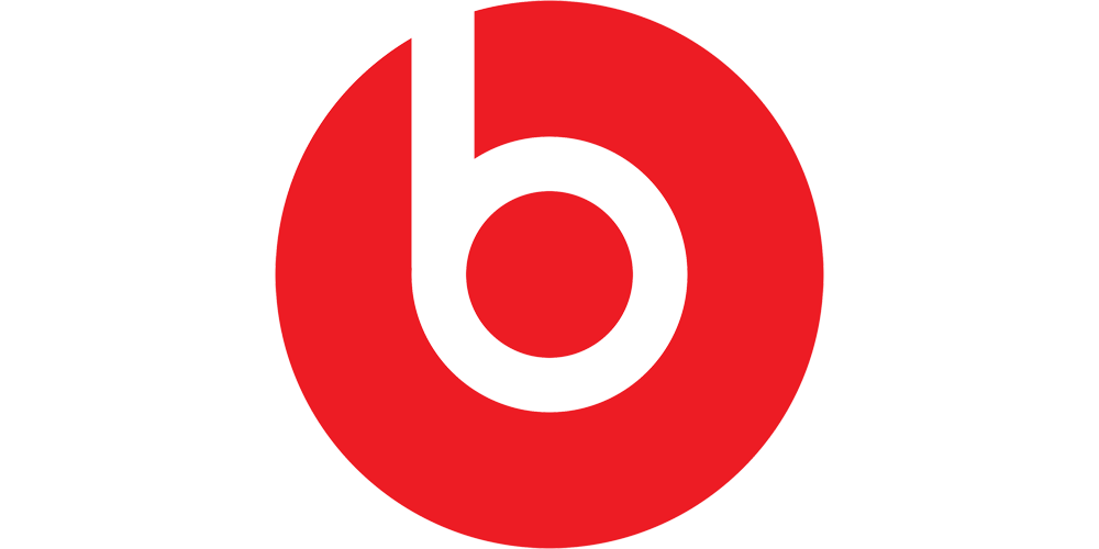 Beats logo shows a man wearing headphones which is the basic function of it.
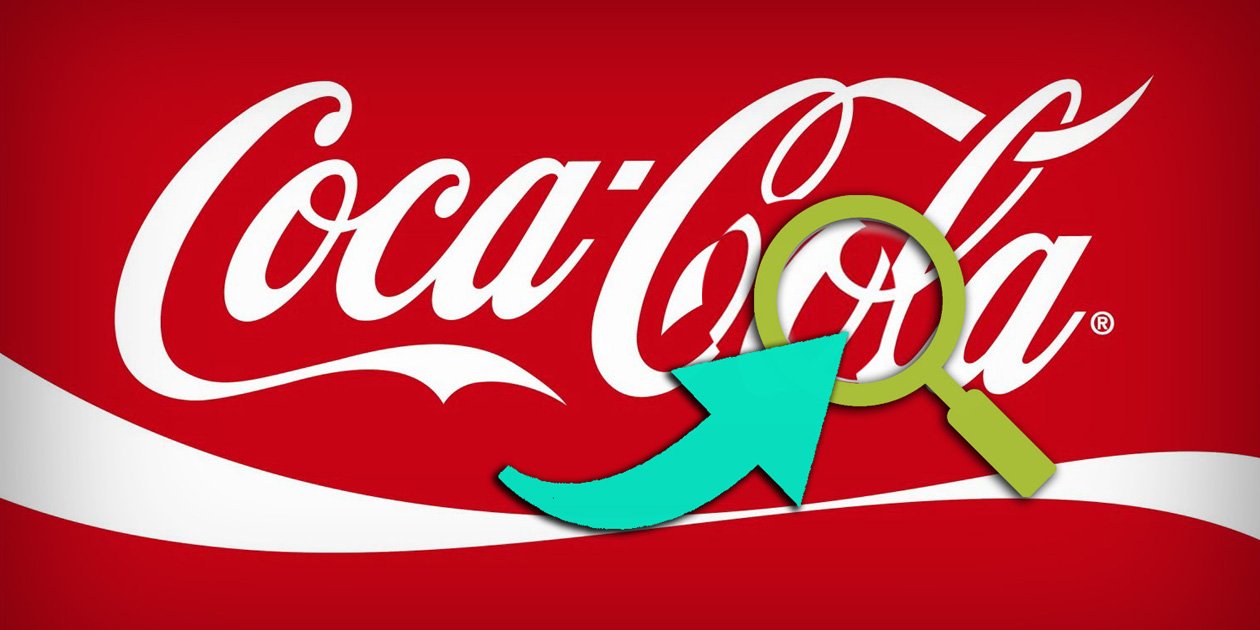
4. Coca-Cola:
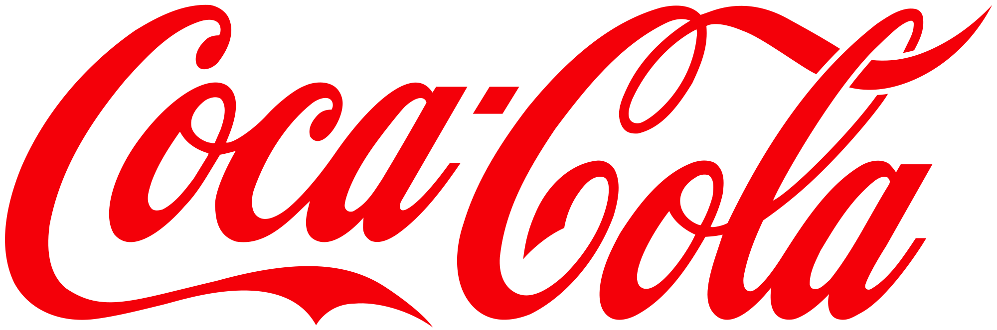 The space in between the alphabets O and L, if shown with focus makes a Danish flag.
3. Pepsi:
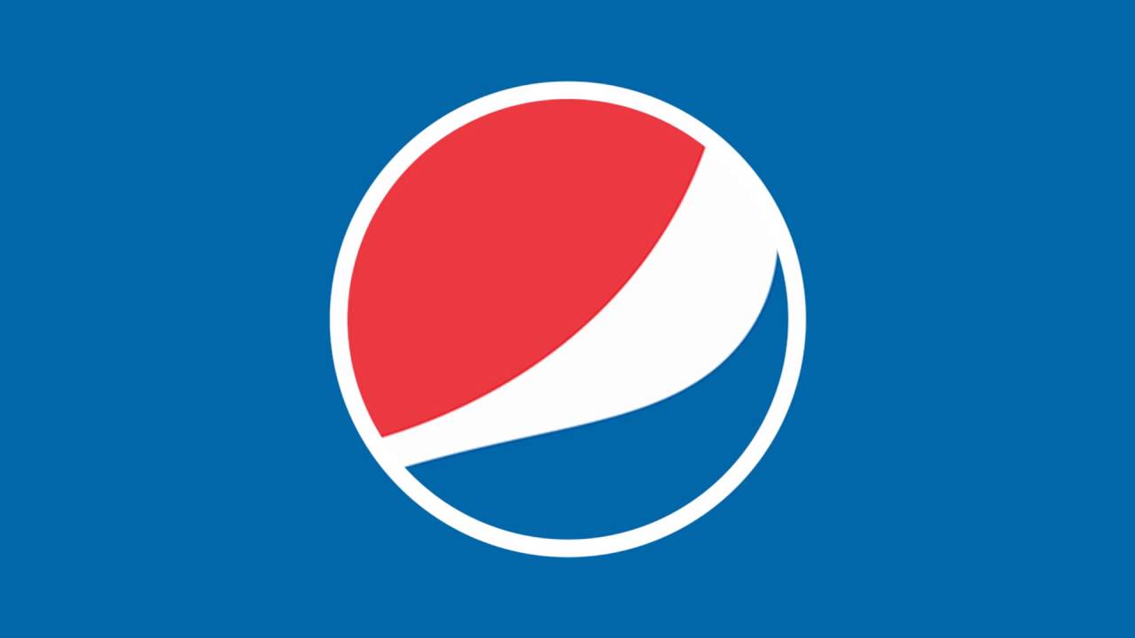 The colors of the logo of Pepsi blue, white and red represent the colors of America. Its logo also shows some reference to Rene Descartes and Mona Lisa.
2. LG:
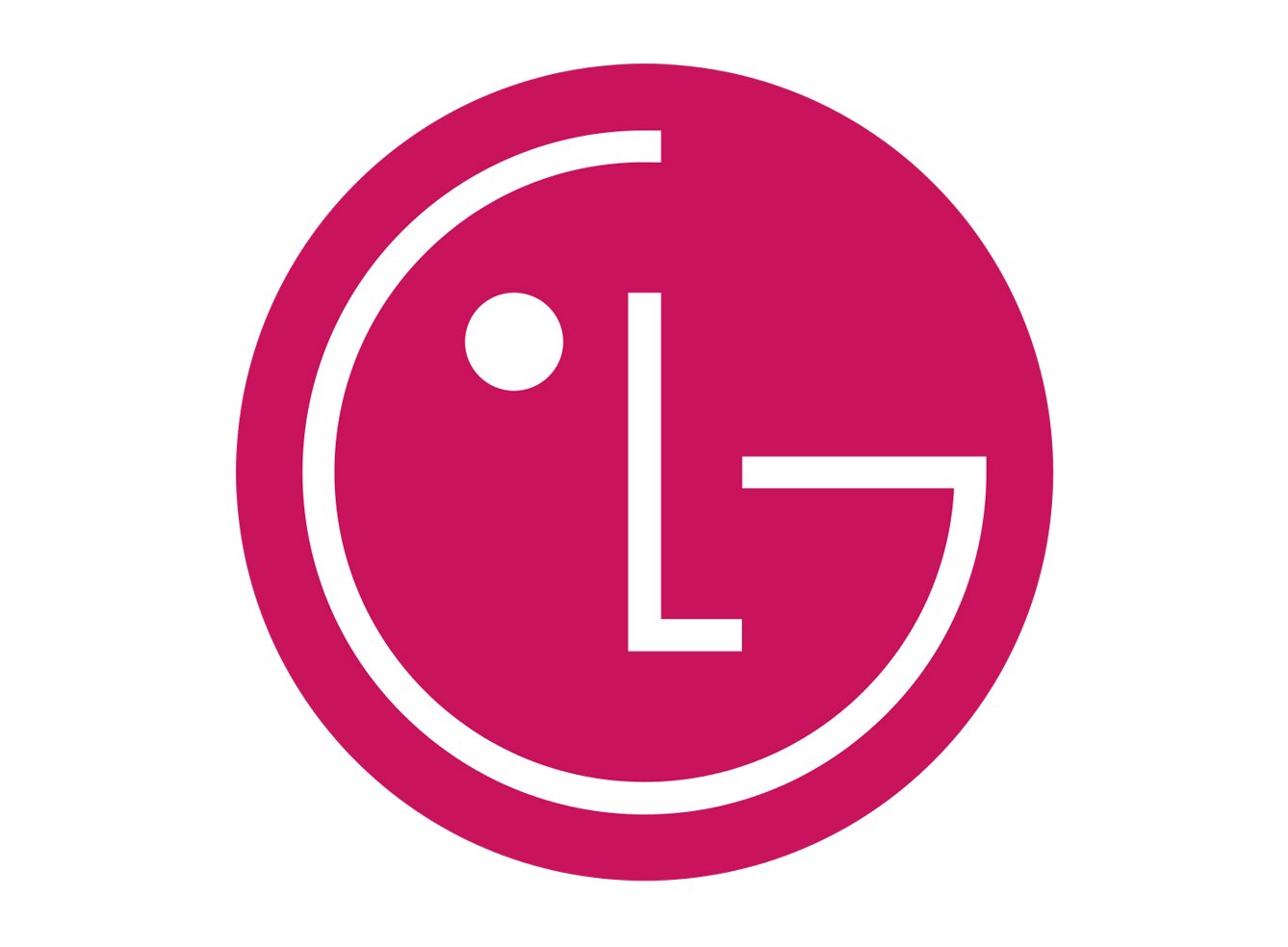 The logo of LG has a sort of human face made on it through which they are showing that the company will serve the common man.
1. Google:
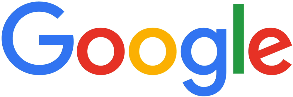 The logo of Google has different colors through which they are trying to give the message they don’t compromise on rules and also the initials are making the logo look playful and friendly.